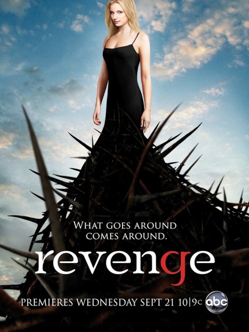
The main
signifier of this poster is the woman, as she is the only person there and she
is the first thing we look at. From this we can gather she is the main
character,
She is
wearing a black dress which leads down to thorns which has connotations of evil
and mysterious, which also relates to her facial expression as she is giving us
direct mode of address but she is mysteriously glaring at us. Her body position
is quite firm to represent a serious character The use of male gaze can also make the audience want to watch the programme. She is contrast to the
back ground as it is much more bright, there is clouds in the background which
makes it not a perfect sky this could relate to the story line, but she
dominants the poster as her and her dress takes up most of the space and gets
the most attention.
When then look at the quote ‘what goes around comes around’ which is the opposite colour to her dress so that it stands out, as is the title except for the letter ‘g’ which is in red which has connotations of evilness. The font is quiet feminine but has a sharp edge which could tell us something about the character. As this is a promotion poster is has the date of which the programme premieres and this is also in a white font to make it stand out from the dress, and then the company that produces it follows this to give the programme quality. Both the quote and date are in capital letters but smaller than the title as the title should be what is standing out the most but they still want the other text to be noticed.
DEXTER
 The main
signifier of this poster is the man as he is the only character on the poster.
Again from this we can gather he is the main character.
The main
signifier of this poster is the man as he is the only character on the poster.
Again from this we can gather he is the main character.
It is an
extreme close up so we can only see his face, we are getting direct mode of
address and from his facial expression we can assume he is angry about
something. There is also a cut on his face which could contribute to the story line We can only see the top of his top, but his facial hair has
connotations of ‘rough and ready’ which can relate to using a female gaze
character.
This poster
is very simple and it is landscape which is unusually, but there is nothing
specific about the background except that it blends from blue down to a misty
brown, so this automatically makes the character stand out the most.
The quote,
title and date are all in the same colour and similar fonts. They are all in a
masculine sharp font, but the title and the date are in capital letters because
they are the ones that want to draw the most attention to. The American television
channel is in a different colour as they would want this to be made clear and
not blend in with all the other text, this is also there to give the programme quality.
PRISON BREAK

PRISON BREAK
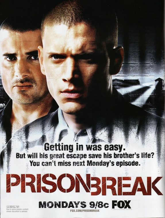
The main
signifier in this poster is that man in front of the other, as he is the first
character we look at and also he takes up more space than the other and is in
the centre of the poster. Unlike the other posters there is two characters on
this one which says both these characters could be equally important in the
show, but as one is positioned in front of the other this shows us he will be
the character with more power.
The shot is
a close up as we can only see the characters from the shoulders up, it is also uses the female gaze. We are
getting direct mode of address from both characters but from their facial
expressions we can gather they are angry as they both have pierced eyes, and a
very serious face.
The lighting
is very dark which connotes mystery, and there is two lights being placed on
the two characters which brings them out from the background but there is still
a dark shadow hitting both characters from the right. This shadow is very
strong and it covers half of the main man’s face which adds to the mystery of
this character. Both characters are male and there is no representation of
women which is playing on the stereotype of women being weak characters. The lighting at the bottom of the poster is
much lighter as this is were all the text is and this bit wants to stand out.
The text is
a very manly font and really stands out from the background. We know which part
is the title as it is a different colour and the biggest text on the poster and
also is the brightest part of the poster. The date and the broadcasting company
‘FOX’ is the second biggest as they want this to be clear and to stick in the
audiences head, and to also give it quality. The quote is then slightly smaller but as it
is still around the title it is still noticeable.
No comments:
Post a Comment